Monday, 12 December 2016

Places, Politics and Printmaking – The Artwork of Imogen Thea Humphris


Guest post by Lynn Reynolds

It’s always a pleasure to discover art I’ve never encountered before, and the recent Festival of Print held by East London Printmakers was a veritable wunderkammer of talent.

Imogen’s work was on display at the Festive Open Studios segment of the event, modestly occupying the table furthest away from the nibbles and mince pies. The first thing to catch my eye was this:


It’s a map of the strip clubs of east London, produced for the East London Strippers Collective. The collective, I was delighted to learn, is a real organisation dedicated to improving the image of and working conditions for professional strippers in the capital’s easternmost boroughs.

And of course there’s a story behind the map. “I wanted to capture a snapshot of the strip club industry in east London as it was at the time, because Hackney Council (among others) is making it harder for these venues to become licensed,” said Imogen.

As I browsed through the other prints on Imogen’s stall, it became clear that her work is all about expressing the struggles and conflicts which happen in different places. One especially striking image, a photogravure, depicted a chaotic tower of shipping container-like structures reaching for the distant sky, a Heath Robinson-style tower of Babel.


The whole thing is topped by a sign in Hungarian. Most of us can’t read it, because this is not a language we’re familiar with. This is the House of Refuge, a fictional structure created by Imogen to represent the experience of refuges travelling across Europe. It’s not clear whether the house is a sanctuary, place of hostility or all of the above. We’ll just have to wait and see.

It wasn’t surprising to learn that Imogen’s background is a rich one, filled with diverse influences. She studied architecture for six years, but knew early on that practising this profession wasn’t for her. Instead, she focused on international development and conflict, and set out to explore this specialist interest as a fine artist.

This strikes me as a timely decision.

We now live in a world where it’s hard to ignore the consequences of war, climate change, oppression and poverty. Our politicians are masters of chaos, and society is becoming ever more polarised.

It seems to me that we need artists like Imogen more than ever. The beauty and virtuosity of her work connects with the viewer on a deep level, and helps us move beyond the reassuringly simple ‘us and them’ perspective sold by the people in power.

When I went to the Festival of Print I didn’t expect to find a beacon of sanity for our times, but that’s exactly what happened. That’s why I hope ever more people get to experience the work of this fascinating artist.

Imogen Thea Humphris, Artist and Illustrator

Monday, 5 December 2016

Openness at the German Pavilion, Venice Architecture Biennale 2016

A thought-provoking, moving and inspiring display

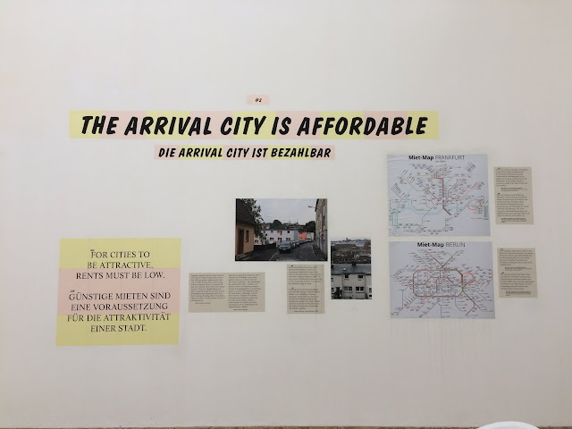
For this year's Architecture Biennale in Venice, the Germans, with the permission of the authorities, created large openings in the walls of their listed Pavilion, to symbolise openness. The theme of the display was "Making Heimat. Germany, Arrival Country", an investigation of the "urban, architectural and social conditions of arrival cities in Germany".


Dsiplays on the walls of the pavilion illustrated eight principles pertaining to how things should be set up in "arrival cities", the places where refugees and migrants live. The points they made were sensible, well thought-out, and not always self-evident.

I found it an inspiring and moving exhibit, especially in the light of recent events in the UK and the US. It was a good symbol for a country which has now been thrust into the role of leader of the liberal and decent world. A refreshing change from the poisonous, xenophobic bigoted mood in contemporary Britain.

Here are some pictures I took. It's worth reading the text.


More information on the project is available at makingheimat.de/ .


Monday, 28 November 2016

Cadorin exhibition at the Fortuny Museum

Mariano Fortuny (1871-1949) was born in Spain but settled in Venice, and is best known as a designer of beautiful textiles. He was also a stage and lighting designer, painter and a designer of interiors. His house and studio in Venice was given to the city by his widow in 1956, and is now a museum. It is used for temporary exhibitions during which works by other artists are displayed alongside Fortuny's own work, fabrics, and other objects he owned and produced.

This must be one of the most beautiful interiors in Venice. It is also a nice place to be reminded that artistic production continued in Venice after the fall of the Venetian Republic in 1797.

The museum is only open for temporary exhibitions. We visited it during an exhibition dedicated to the Cadorin family, which was marvellous, as are all the exhibitions held at the Fortuny.

For more details, see the Fortuny Palace website.

Here are pictures taken during our visit, presented without any further comment.


Palazzo Fortuny
Campo S. Beneto, 3780, 30126 San Marco, Venezia VE, Italy


Sunday, 13 November 2016

Napoleon, by Abel Gance

New release of the 1927 epic, digitally restored


What an amazing film it was!

Today I watched the silent movie Napoleon, made by Abel Gance in 1927, and now digitally restored by Kevin Brownlow, an extraordinary project that has taken 50 years of hard work. The film is about 5 1/2 hours long, and it was shown today at the Barbican with two intervals plus a lunch break, so it was a whole day watching one great, epic movie.

The film is immensely sophisticated, both in the way the story is told, and in its cinematography. The range of techniques is extraordinary, and despite having been made in 1927, it feels very modern. It was shot in monochrome, but the film was tinted red, yellow, blue and orange in different scenes. In the final act, the film has a triptych format, with three contiguous screens.

It tells the story of Napoleon's early life and his rise to power, and deals with issues of personality, childhood influences, love, and the nature of leadership. It addresses things like the consequences of revolutions, autocracy, demagoguery. I don't want to give any spoilers at all, except to say that there are things in it which are pertinent to recent events in Britain, the United States, and Europe.

The term silent film is misleading, because although there is no spoken dialogue, there was a marvellous soundtrack, an original work by Carl Davis, based largely on works by Beethoven (I recognised his 3rd, 6th and 7th symphonies, and the Egmont overture), as well as other tunes, some of which that were familiar to me. It does have something of the music video about it. It's certainly a treat for Beethoven enthusiasts (and a good introduction to Beethoven for someone who does not know his work). It's like a grand, magnificent operatic epic without spoken dialogue.


The film will be released on DVD and Blu-ray, and available on the BFI website. However this is one for the big screen, preferably the biggest screen you can find. I'm looking out for an IMAX screening, or any other screening, because I'd certainly go to see it again.

More reading:
Wikipedia
The story from the BFI
More about the film (i.e. spoilers) from the BFI

Sunday, 30 October 2016

More from the London Design Biennale 2016

A few other brief snippets from the London Design Biennale, where the theme was Utopia, interpreted in a variety of ways at different national pavilions

China:
Shenzhen: New Peak by URBANUS

The population of Shenzhen, just across the border from Hong Kong, has grown in 35 years from 300,000 to over 17 million. In this exhibit, the architecture team from URBANUS illustrated a proposal for a megastructure, as an alternative to urban sprawl. In the middle was a model of the megastructure. What struck me was that it was not a solid monolith, but had lots of openings and spaces within it, so that there would be lots of light and fresh air even in the middle of the structure.

There’s nothing new in the concept of a megastructure housing an entire city, but I thought this one was rather well illustrated, with a video on the wall of the pavilion showing it being built on the proposed site, and another animation showing what life might be like in one of these  places.

I’m sure that none of the technical issues have been worked out, and I don’t know if such a structure could actually be built. The animation did look a little like a video game, but it was nevertheless a seductive vision. If something like that were to be built, I’d quite like to visit.

More details from the designers' page here.

Israel:
AIDrop by Yaniv Kadosh

This is a system which allows 3 kg packages of  supplies to be air-dropped to disaster zones. The payload is carried in a unit, inspired by the sycamore tree, which rotates and thereby slows its descent without the need for a parachute.


This seemed like a clever idea. The item itself was on display, and it would appear that it has actually been tested and does work.


Here is the designer's website.

Taiwan:
Eatopia by Rain Wu, Shikai Tseng, et al

This was a beautifully designed room, with dishes laid out on a table. The food was meant to “explore the creative melting pot of Taiwanese identities”. It looked pretty, but unlike the Lebanese pavilion, it was not for public consumption, except during special events. No matter, it was lovely to look at, and enjoyable to walk through.


Finally, 
here is something I saw by the reception desk at the Spanish pavilion which you could make yourself for your own home:


Thursday, 13 October 2016

Two versions of socialist utopianism at the London Design Biennale

The theme of the 2016 London Design Biennale, was “Utopia”. This was explored in many different ways in the various national pavilions. The displays ranged from the abstract and conceptual, to practical projects and real objects, intended for use in the real world.

Two fascinating pavilions were those of two former socialist countries, Russia, and Chile, showing two different aspects of socialist utopianism.

The Russian exhibition, Discovering Utopia: Lost Archives of Soviet Design, was a catalogue of projects from created at the All-Union Soviet Institute of Technical Aesthetics (VNIITE) and Soviet Design Studios (SHKB) between the 1960s and the 1980s. Here were the designs for products which would contribute to realising the socialist utopia. The institute employed not only designers, but also philosophers, sociologists and historians of art and culture. On display were a wide range of products: vehicles, trains, a hydrofoil, kitchen utensils, electronic goods (including a precusor of modern computers and tablets), and much more. Some of these went into production, like the hydrofoil which was exported to Britain, but most were never realised due to economic or technical constraints.


Here are some examples of the projects, from the website of the Moscow Design Museum


Seating in this section was provided in the form of cardboard chairs, made from an old Soviet design discovered by the curators. They were very comfortable, in fact. But note, should you be tempted to have a go at making one, that the cardboard from which they were made was of a heavier grade than that used for your usual mail order delivery.


The Chilean pavilion, The Counterculture Room, was an exhibition about the Chilean Cybersyn project, which took place from 1971 – 1973 during the time of the socialist president Salvador Allende. Using the computer technology available at the time, such as telex machines, the aim of the project was to provide the government with real time data that would help them run the economy. The architect of the system was an English business consultant Stafford Beer. This was a sort of precursor of the internet and “big data” of today. The experiment ended with the assassination of Allende in a military coup.

The heart of the display was a reconstruction of the operations room , deigned by Gui Bonsiepe, with its futuristic swivel chairs, and screens for displaying data. Each chair had a control panel on one of the armrests. On the other armrest was that other essential accessory of the period, an ashtray.


Here are some images of the original design and the original room:


You can find out more about Project Cybersyn here http://99percentinvisible.org/episode/project-cybersyn/

That's all for today. There was lots more at the biennale, so please come back next week.