Thursday, 28 January 2016

Silent movie Piccadilly (1929) at Wilton's

Seeing this classic silent film has whetted my appetite for more

A few weeks ago, on a whim, I booked tickets for the silent movie Piccadilly, directed by EA Dupont and released in 1929, which was screened at Wilton’s. I’m not really familiar with silent films, and was not hitherto a fan of the genre, but I thought I’d give this one a go. I had not previously heard of it, but I understood from the publicity material that it was one of the great classic British silent movies, and it sounded interesting. I was also keen to re-visit Wilton’s, after its recent refurbishment.


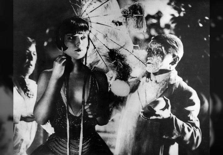
As for the film, it's set in London in the 1920s, in a swanky night club. The story centres around Shosho (played by the American actress Anna May Wong), a Chinese dishwasher working in the club who becomes the establishment’s top dancer and main attraction. "I danced once before in Limehouse but there was trouble, men, knives..." she says. There is jealousy, sex and intrigue, and things take a dramatic turn when Shosho is murdered. It’s been described as the first film noir, before the term was coined.


I hadn’t seen many silent films before, and hadn’t seen one for a long time, so I wasn’t really sure what to expect, but I must confess that Piccadilly was more sophisticated than I had expected. It was beautifully filmed, and the action was fast-paced, with never a dull moment. I didn’t figure out until the very end who the murderer was.


I had assumed that without a spoken soundtrack, there would be something missing from the experience, and in this I was totally wrong. The live musical accompaniment composed by the musicians themselves, pianist (Andrew Oliver) and percussionist (Nicholas Ball) was truly outstanding. They played continuously through the entire film (with an interval half way through), and the music was totally and seamlessly integrated with the screenplay, complementing and reinforcing the visual element of the performance, and making the experience in some ways akin to opera (without the singing).

I enjoyed the depiction of the glamorous 1920s London nightlife, and the contrast with Limehouse in the East End, where Chinatown was located in those days. The Chinese were depicted as East Enders who happened to be Chinese, rather than some sort of exotic species.


I don't know how or why Shosho chose a sort of bikini with a Siamese or Cambodian head-dress as a “Chinese” costume, but it was amusing, and seemed believable in the context of the times when the film was made.


The experience has left me with a new appreciation of and interest in silent films. I’d like to see a few more if the opportunity presents itself. I really didn’t appreciate prior to this the importance of the accompanying music. I’m certainly going to keep an eye out for future productions by Lucky Dog Picturehouse, the team who presented this version of Piccadilly.

Below is a trailer for the movie from the British Film Institute, but with a different soundtrack, and different music. It's worth watching if you are not familiar with the film, but it doesn't really convey the experience of the version I saw at Wilton's. The movie is available to rent from the BFI for viewing online (I haven't watched it myself).



Thursday, 21 January 2016

Postmodern architecture returns?

Postmodernism came and went, but it looks like it might be back
It has recently dawned on me that there’s a bit of a postmodern revival going on. In fact, people have been writing about it for about 5 years, but I guess I’ve been a bit slow to notice. I remember the beginnings of postmodern architecture in the late 1970s, and I recall that from the outset, I had reservations about it. Below is a picture of the hitherto modernist architect Philip Johnson taken in 1978, with a model of his recently completed AT&T building. It created quite a stir at the time, but big business lapped it up.
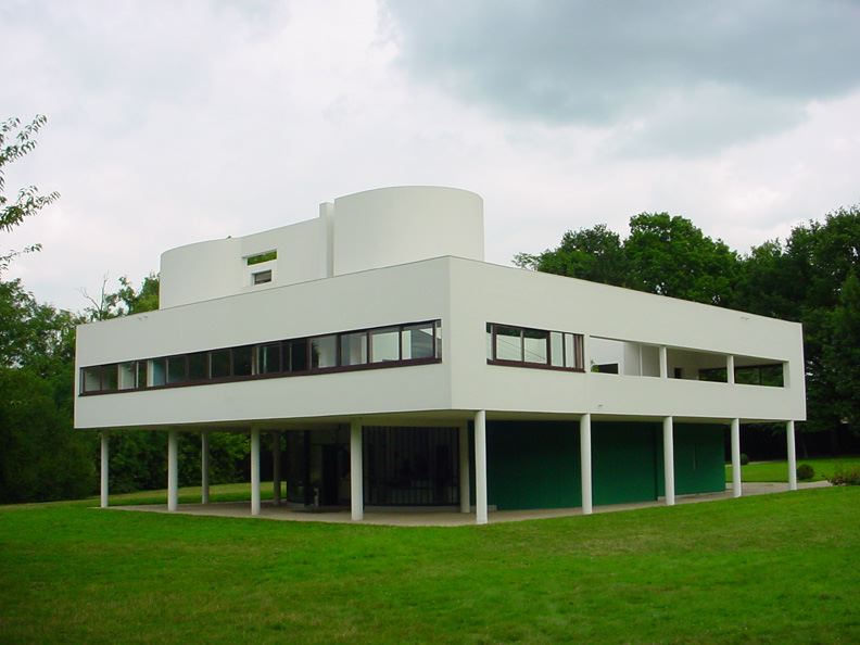
The modern movement gave rise to some truly great buildings, although there was a lot of indifferent or even poor quality architecture as well, produced in large quantities at a time of massive urban renewal. More importantly, the urban planning of the modern period was often misguided, resulting in the destruction of established neighbourhoods, the prioritisation of cars over pedestrians, the resettling of people into housing estates with poor infrastructure, and so on. It didn't help that the technology of the time couldn't always cope. The roof of Corbusier's famous Villa Savoye (pictured below) leaked badly into the bedroom of the owner's son, who got pneumonia and had to spend a year recuperating in a sanatorium during that pre-antibiotic era.
https://en.wikipedia.org/wiki/Villa_Savoye 
All this gave modernism a bad press, perhaps more so in some countries than others. The reaction in Britain seems to have been more hostile than in some other places, and I'm not sure if this can be dismissed with glib references to innate conservatism. 
While I appreciate that there were aspects of modern architecture which some people did not like, much of postmodernism seemed no better, or worse. I could appreciate the architects' interest in ornamentation, wit and historical references, it much of it seemed rather crude and lacking in detail. I particularly disliked the attempts at classical references, which might have looked extremely attractive in drawings, and acceptable in large-scale photographs, but always, it seemed to me, lacked to finesse and subtlety of the prototypes they were meant to be referring to. I know the intention was sometimes to be witty, but often to me it didn't seem that funny or clever.


I suppose the examples of postmodernism which comes to mind most often to me, because I see a lot of it, is the Broadgate Centre, the development which incorporates Liverpool Street station in London. The main façade along Bishopsgate seems to exemplify the sort of thing that I dislike about a certain type of postmodernism: massive, out of scale buildings clad in expensive materials with crude details that seem to make a cynical nod to a classical tradition. Below is a screenshot from Google street view. Interestingly, I couldn't find any pictures of this elevation when I searched online.
Likewise Paternoster Square, with its crude, pseudo-classical cladding. 
I was rather pleased when I realised some time around the early 2000s that postmodernism seemed to have ended, to be replaced by a modernist revival, softened by the passage of time, with quite a lot of new buildings appearing which seemed to be generally rather well-designed, or at least inoffensive. But now it appears that post modernism is making a comeback.
There were of course good examples of post modern architecture, during its heyday. The first property I rented was a small flat in a postmodern building, the Circle, by CZWG architects (it was around 1992, during a the property slump and I could afford it on a junior doctor’s salary). I liked it the first time I saw it, and I still like it. Here's another screenshot from Google streetview.
I hope that things work out the second time round for postmodern architecture. I'm all for wit and humour, if done well. Meanwhile, here are a few examples of postmodern architecture and design that I know and have actually seen for myself to illustrate that it can work, even though I sincerely hope that modernism is not finished yet.
China Wharf, also by CZWG:

No1 Poultry, by James Stirling 

The bookshop at the Venice Biennale Gardens, also by James Stirling


Friday, 15 January 2016

Bring back the Banyan

Before the smoking jacket, there was the banyan

On a recent visit to the victoria and Albert museum, I came across the banyan, a long, loose robe like a dressing gown, worn at home by 18th-century gentlemen. Unlike lot of 18th century clothing, it looked rather comfortable.


The banyan originated with robes worn by traders working for the East India Company in the 17th century, and evolved over the 18th century into various forms. Some were loose, like kimonos, or voluminous. Others were more fitted, like the European coats of the day. The finest examples were made from a whole range of luxurious fabrics: oriental silks, damasks, cotton chintz, and so on. They were meant for informal relaxation at home, but also worn while receiving and entertaining guests, rather like the smoking jackets of later periods, and often worn with a cap or turban, which replaced the more formal periwig.


It was the sort of garment that scholars and intellectuals liked to wear when having their portraits painted.
"Loose dresses contribute to the easy and vigorous exercise of the faculties of the mind. This remark is so obvious, and so generally known, that we find studious men are always painted in gowns, when they are seated in their libraries." (Benjamin Rush)

Here's one of Isaac Newton, by James Thornhill:


And here is one of the art historian Johann Joachim Winckelmann, by Anton von Maron:


The weather has been getting a bit colder of late, and we are always being encouraged to save energy and not overheat our houses. A banyan seems just the thing for lounging around semi recumbent on one’s sofa, book in one hand, hot coffee by the side, with the central heating turned down somewhat.

They don’t seem to be easy to get hold of though. If you want to make one for yourself, or get someone to do it, patterns are available, such as this one. A couple of people in the US make them, and sell them on Etsy.

I’m not about to shell out myself for one of them, and it's the spirit of the thing that matters, not the actual item. I've resurrected an old heavy duty bathrobe, which I hadn’t used for a while. I got it as a present some years ago.

The only problem is that a banyan is not the ideal garment if, in addition to being a scholar and intellectual, or engaging in witty repartee, a chap is also obliged to undertake mundane domestic tasks like making coffee or doing the washing up, as it rather gets in the way. An 18th-century banyan-wearing gentleman presumably did not have to bother with such banal trifles, but such is modern life, I suppose.


Thursday, 7 January 2016

Bigoli and Udon in Salsa

Onions, anchovies, and cross-cultural noodle substitution

When I was living in Singapore in the 1980s, a friend told me that the local flat noodles known as  mee pok, were an excellent substitute for fresh tagliatelle. I’ve never tested this out myself, but I’m sure she was right. I was reminded of this recently when it was pointed out to me that the fresh version of the Italian pasta known as bigoli was rather similar to Japanese udon noodles.

Bigoli is a type of pasta made in the Veneto region from buckwheat or whole wheat flour, and most commonly sold as dried pasta. It looks like wholewheat spaghetti, but the texture is not as grainy. It is widely available in supermarkets and shops in Venice. However, in England, I’ve only seen it for sale in places like Fortnum and Mason.


Most commonly, it’s served in a sauce made made of onions and anchovies. The dish is known as bigoli in salsa, and I’ve referred to it in a previous blog post on Venetian food. I’m extremely fond of anchovies, and this sauce is incredibly simple to prepare.

There’s also the fresh version of bigoli, and if you are keen you can make it yourself. To do this in the traditional way, you will need a hand-operated gadget called a bigolaro which extrudes the pasta through a plate with holes. If you live outside the Veneto, you can buy one through Amazon.


Alternatively, you can use a meat grinder set to the smallest extrusion size.

I had never tasted fresh bigoli until my last trip to Venice, when I had it at an excellent little establishment just round the corner from the Fortuny Museum, called Teamo. Compared to bigoli made from dried pasta, these noodles were thicker, with a nice chewy texture. I’d had bigoli in salsa many times before, but this was different, and delicious. Incidentally, the other dishes at Teamo were excellent too. The owners used to work at one of the more prestigious establishments in Venice before setting up their own wine bar and restaurant, and it's well worth a visit.

The bigoli at Teamo was, as my companion pointed out to me, reminiscent of Japanese udon. Having neither the inclination nor the necessary equipment for making fresh bigoli, we though we would try using udon when we were back in England.

The salsa is made as follows:
Fry a large quantity of chopped onions in olive oil over low heat until they soften. Take care not to let them brown, and to prevent this from happening, add a little water (or dry white wine) to the pan. When the onions have softened, add the anchovies and continue cooking gently until they have dissolved into the onions. Serve with pasta. Garnish with chopped parsley if so inclined. Note that the recipe does not involve garlic or chilli.

My first attempt was with dried udon which, I discovered when I looked closely at the packet, was made from rice flour.


No matter. The result was excellent. The noodles had a firm, chewy texture which went very well with the onion and anchovy sauce.


My next attempt was with Amoy brand “Straight-to-Wok” udon, widely available in most normal British supermarkets.


With these, there is no need to cook the noodles beforehand, so you just add them to the wok when the salsa is ready, and heat for a few more minutes. This was also excellent. 


Bigoli in salsa is a really easy dish to prepare, apart from the bit where you have to chop the onions. I circumvent this by having in my freezer a supply of ready-chopped diced onions, widely available from many supermarkets. You can also get frozen chopped parsley, at least from Waitrose or Ocado. Of course, udon is not bigoli, but it's an excellent alternative, and in my opinion, neither better nor worse. In the same way, incidentally, that spaghetti is an excellent alternative to flat rice noodles for fried dishes like pad thai or char kway teow (cook the spaghetti before frying it).