A cheerful exhibition at the Barbican gets me thinking about modernism
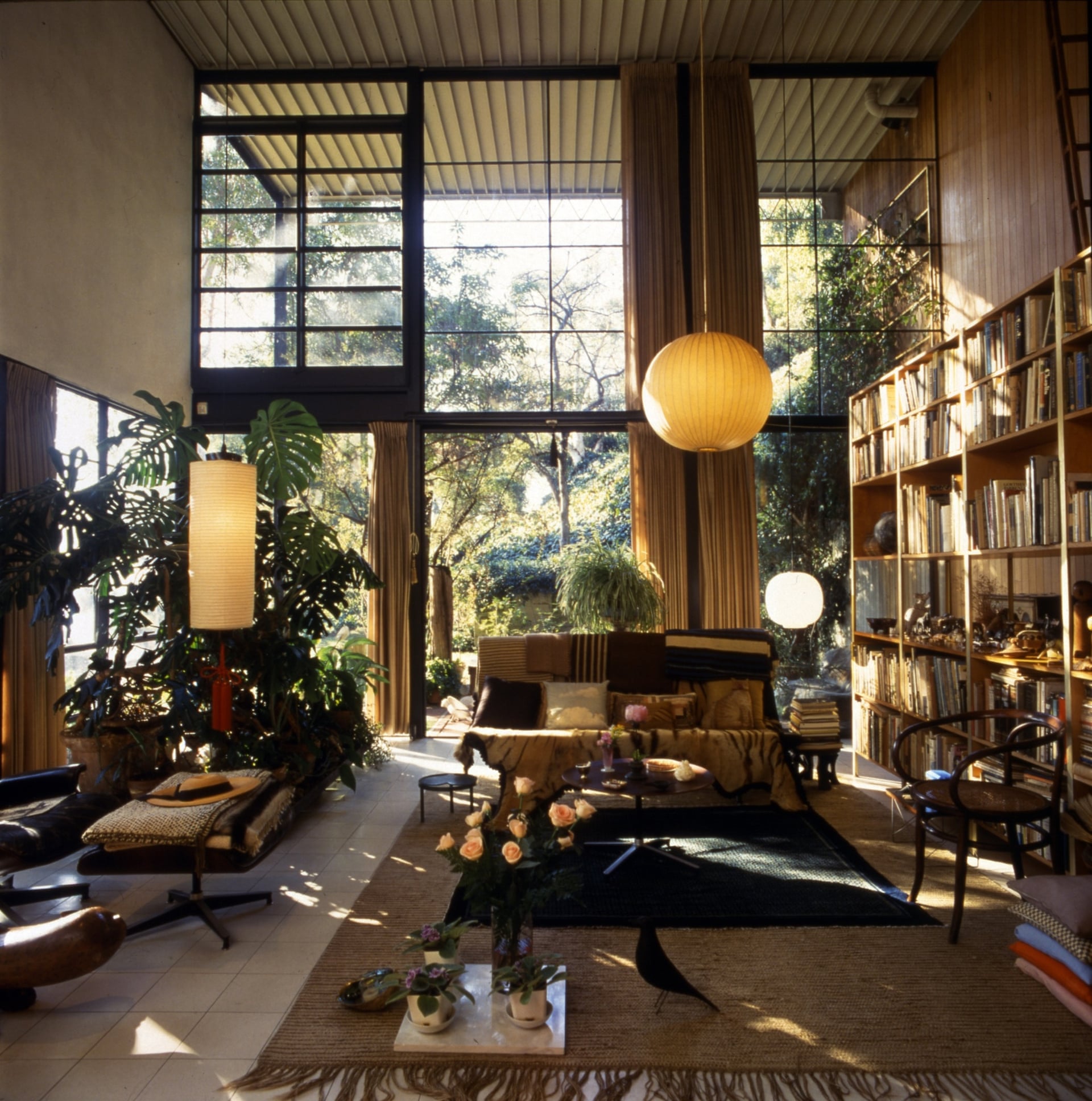
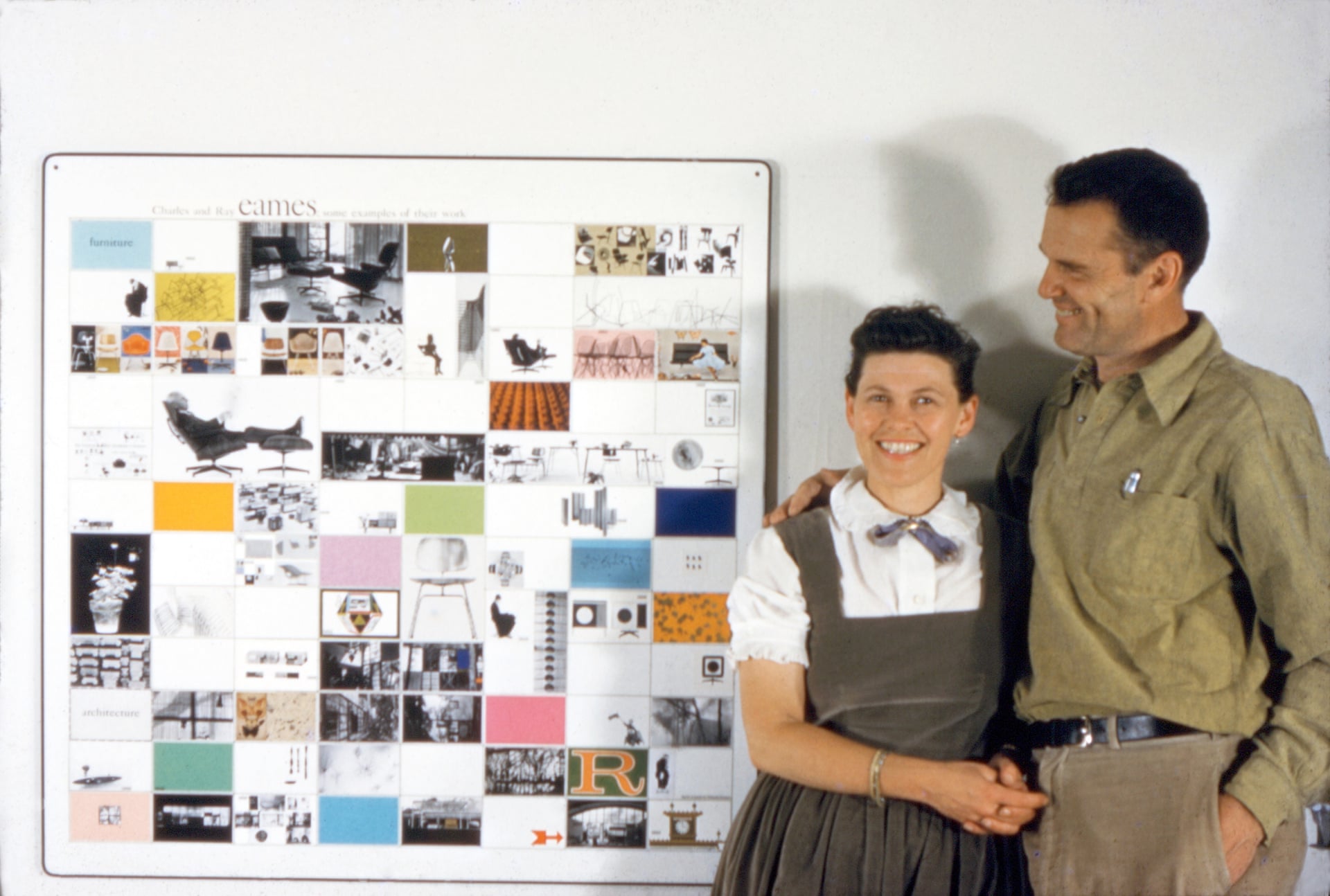
We visited the Eames exhibition at the Barbican on Saturday, the day before it ended. Everyone probably recognises their furniture, and architecture enthusiasts will know their house.
The exhibition was a chance to see many other things: the wooden splint for casualties they designed during the second world war, the exhibitions they planned, the films they made, the things they collected.
Leg splint
Model for IBM pavilion, World's Fair, Brussels 1958
Modular toy stage for children
Their collection of toy ships
It also gave an insight into their attitude towards design. Visiting the Corbusier exhibition in Paris, last year, I found myself a little put off by the architect as a personality, and by the abstruse philosophising, notwithstanding the quality of his work. The Eames exhibition, in contrast, presented the couple as good humoured, rational designers, refreshingly free from arcane and quasi-mystical or pseudo-scientific mumbo jumbo, or “architectology”, as my father used to call it.
"Recognizing the need is the primary condition for design.
"Design is a plan for arranging elements in such a way as best to accomplish a particular purpose. " Charles EamesI was captivated by the air of rationality, cheerfulness, and optimism, as well as by the whimsy and humour of the designers. It seemed to speak of a time at the height of the modern movement when a new and optimistic spirit was in the air. It was only on reflection that I realised that it was actually a rather dark and scary time, with the cold war, the threat of nuclear annihilation, Vietnam, and racial segregation. I was struck by the lack of black people in the images and films, but I suppose the times were different.
Chairs with drawings by Saul Steinberg
It got me thinking about how modern architecture had fallen out of favour in the 1980s Britain. Many people these days express a preference for traditional architecture, or perhaps one should say pre-modernist architecture. But stylistic preferences come and go. At one time, gothic architecture was considered primitive and barbaric. Alberti in Rimini, and Palladio in Vicenza, among the greatest architects of their age, covered historic gothic buildings in classical cladding. Taste is often transient.
I think the failures of modernism have less to do with style and more to do with urban planning and scale. Rehousing the less well-off in high rise estates where there was a lack of infrastructure and poor maintenance created problems which were not due to their architectural style, but often attributed to it. As an antidote to modernism, Ricardo Bofill constructed massive classically-styled housing estates on the edge of Paris. Vast and alienating, they were used for the dystopian move Brazil. You can't remedy problems of scale and planning with stylistic tweaks.
Ricardo Bofill, Les Espaces d'Abraxas, Noisy-le-Grand, 2014. Image © Laurent Kronental
Brasilia
No wonder people preferred the historic town centres, laid out on a human scale. Again, it’s an issue of urban planning, not architectural style. Thankfully, this trend is being reversed. Enlightened urban planners are now designing cities for people, not cars.
There was also the matter of technology. Flat roofs leaked. Before double glazing, the big windows that brought light and nature into the living room also let in the cold. These issues seem to have been resolved with contemporary materials and techniques. Perhaps now we are able to live in modern houses in the way the early modern architects imagined we ought to.
Laura Dewe Mathews, Gingerbread House, London
Lipton Plant Architects, House in Clonbrock Road, Hackney, London


No comments:
Post a Comment